Proteintech Group
Enhancing the e-commerce product search experience for a leading global antibody supplier
Proteintech is a leading producer and distributor of antibodies for the life sciences market. Their products are used in research supporting leading treatments for cancer, COVID, and other well-known diseases. Their main customers are bench scientists experimenting with these treatments. They sell worldwide, with major hubs in Chicago, China, Manchester, and Berlin.
Role
Lead UX Designer
Date & Duration
Nov 2024 - Apr 2025
5 months
Tools Used
Miro
Figma
ChatGPT
Maze

Want a more UX-focused approach rather than just pretty UIs? Check out the research and designs I created for an app that helps scientists work smarter. Deep dive here
The business problem
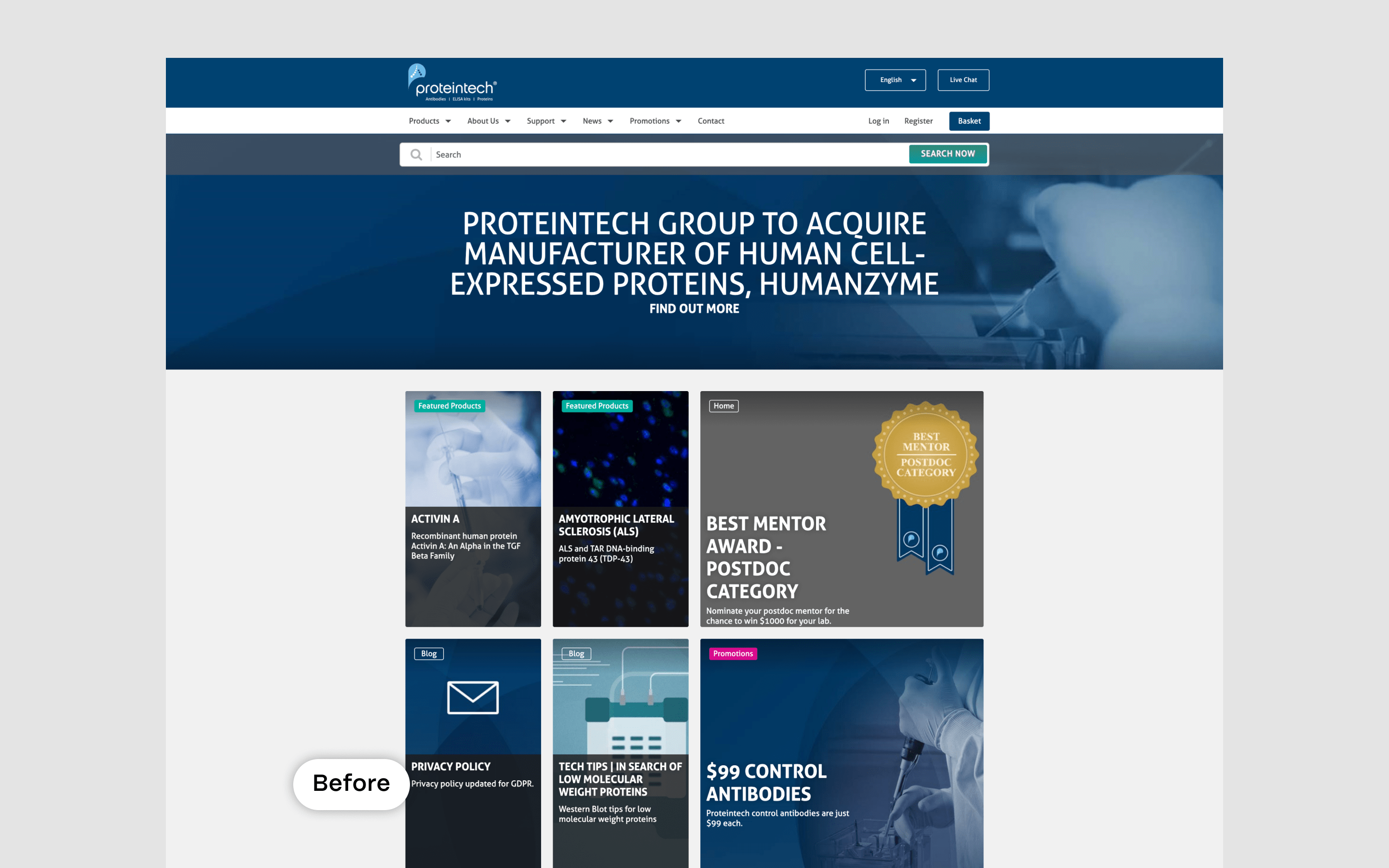
Protientech’s e-commerce platform struggled with product discovery. Users found it difficult to navigate the catalog and locate the right antibody products for their specific research needs, leading to frustration and abandoned sessions before reaching checkout.
The Process
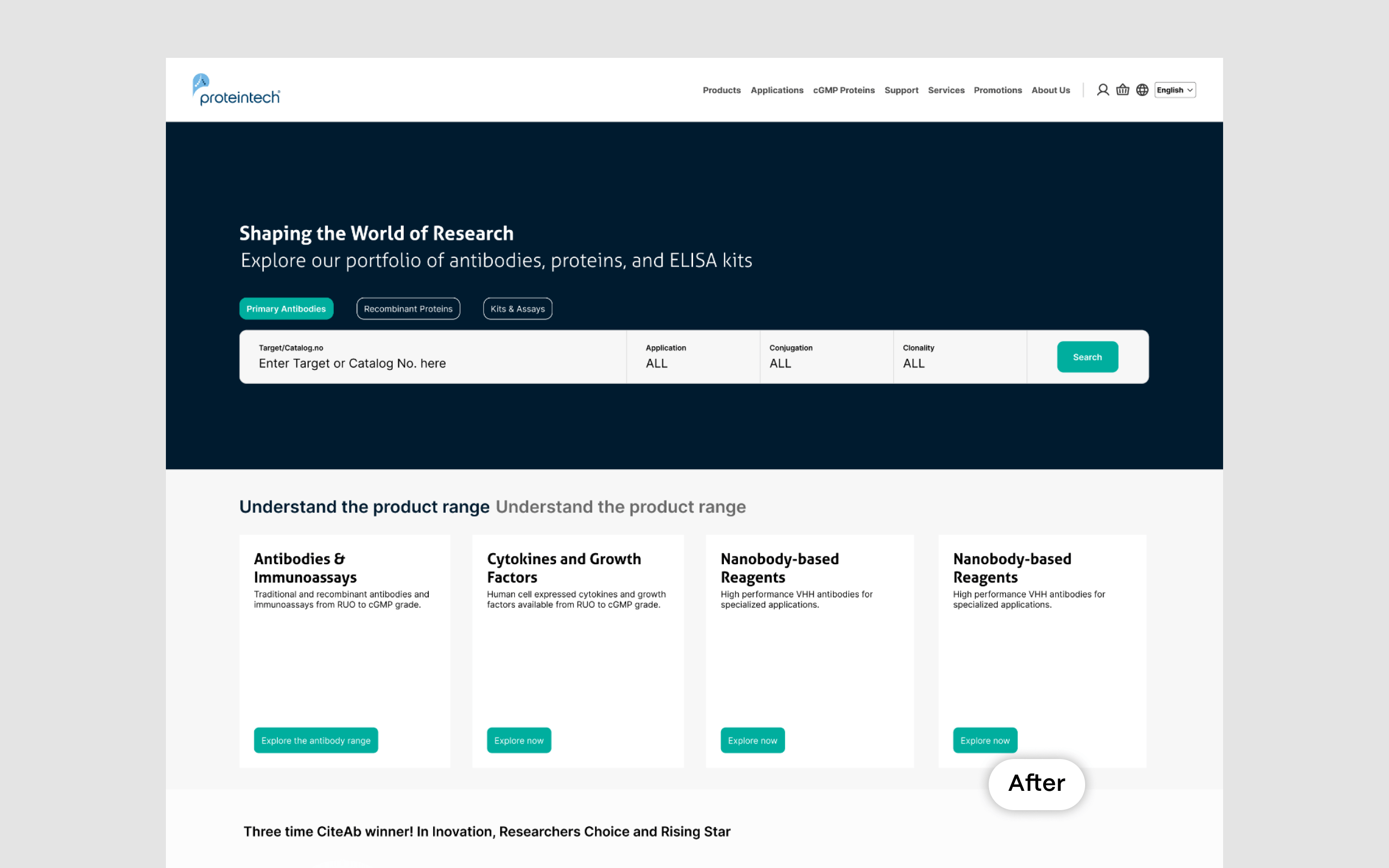
It started with a request to improve the homepage landing. The product range had grown, and the messaging had become unclear—users struggled to understand what Proteintech offered. After workshops and consultations, we took two key steps to improve the experience.
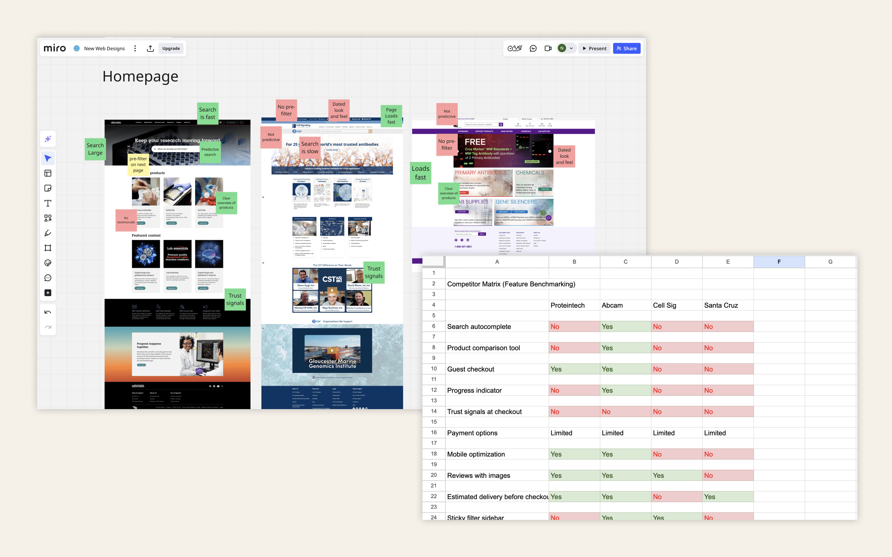
First, we realigned the information architecture (IA) of the navigation to match the updated product range. We ran quick card-sorting exercises with internal scientists, refined the structure, and then validated it with customers through user testing. This helped us streamline the navigation and overall site structure.
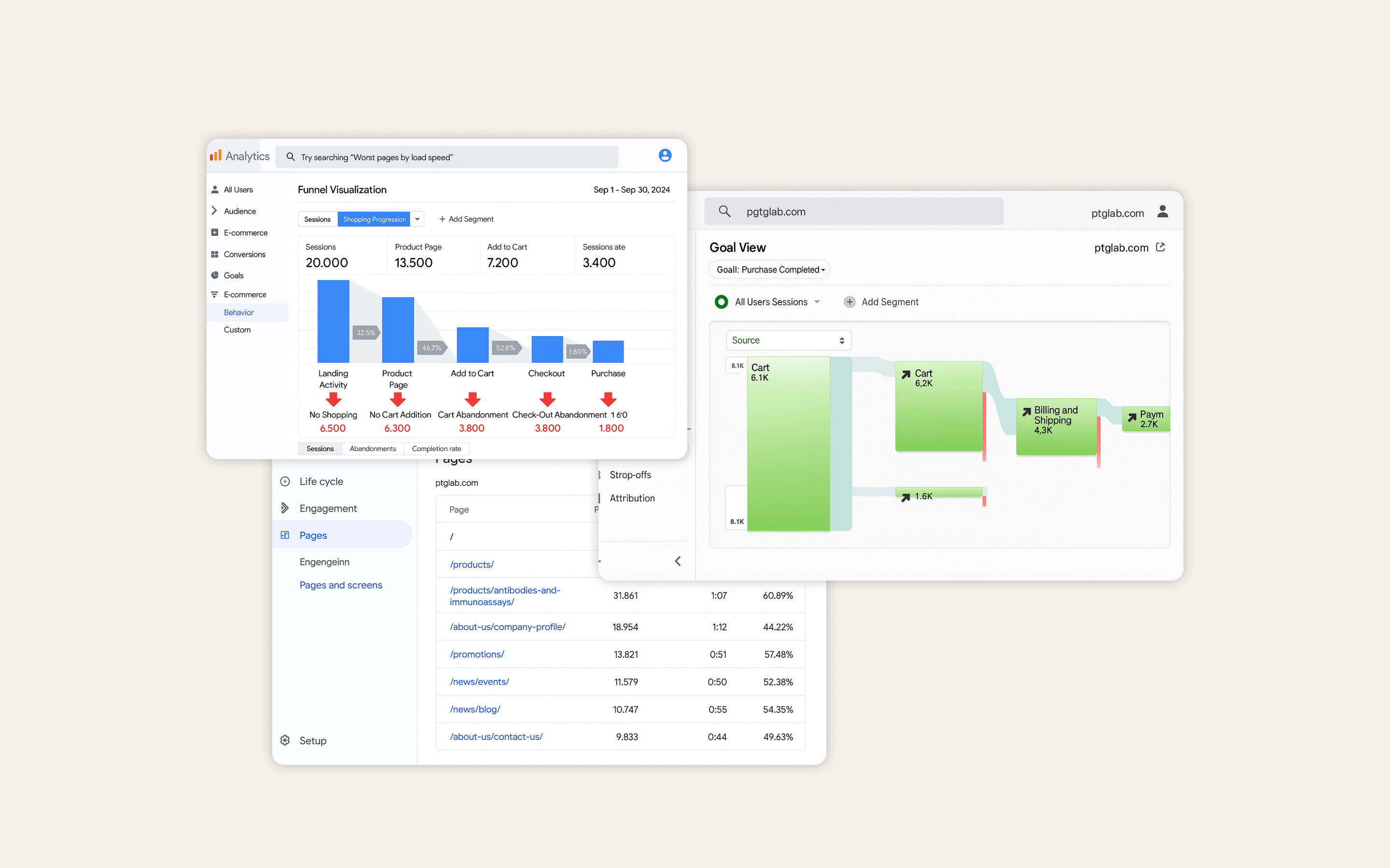
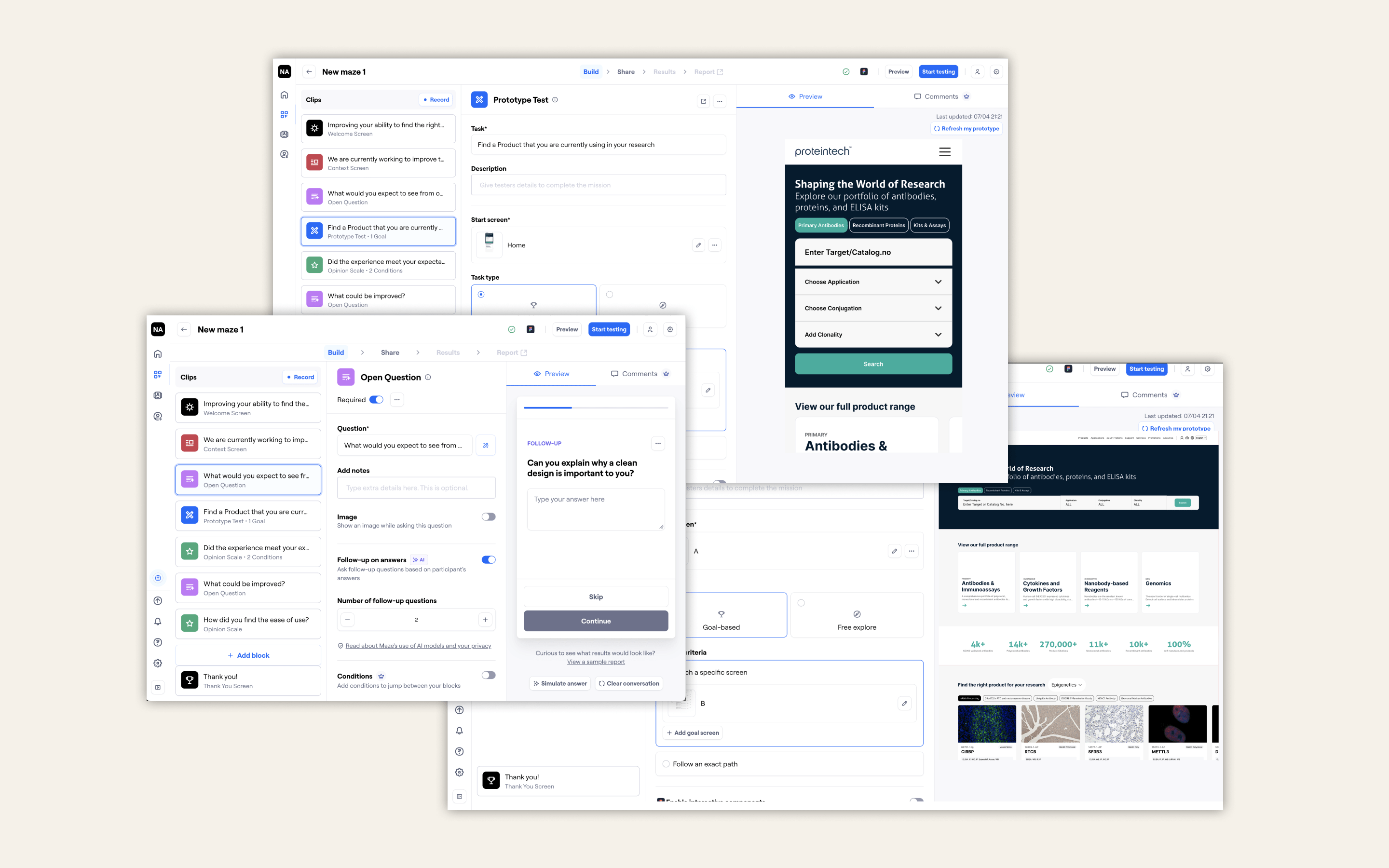
Second, we tackled the overall product search experience. GA revealed noticeable drop-offs, especially on mobile, where completion rates were particularly low. Using a test-and-learn approach, we designed, tested, iterated, and tested again. The budget allowed for a couple of usability testing rounds via Maze.
Results
Reduced the number of 'no results' pages by 10%
Increased product page visits by 18%
Increased items added to basket by 8%
All data is from the first month after go-live, compared to the previous six months. It's worth noting that overall homepage traffic was actually down by around 1,000 unique and returning users during this period.
UX Methods used
Journey Mapping
Workshop Facilitation
User Flow Mapping
Usability Testing
UX Methods used
On-going Feedback (Surveys)
Wireframing & Prototyping
High-fidelity UI Design
Homepage & Search:
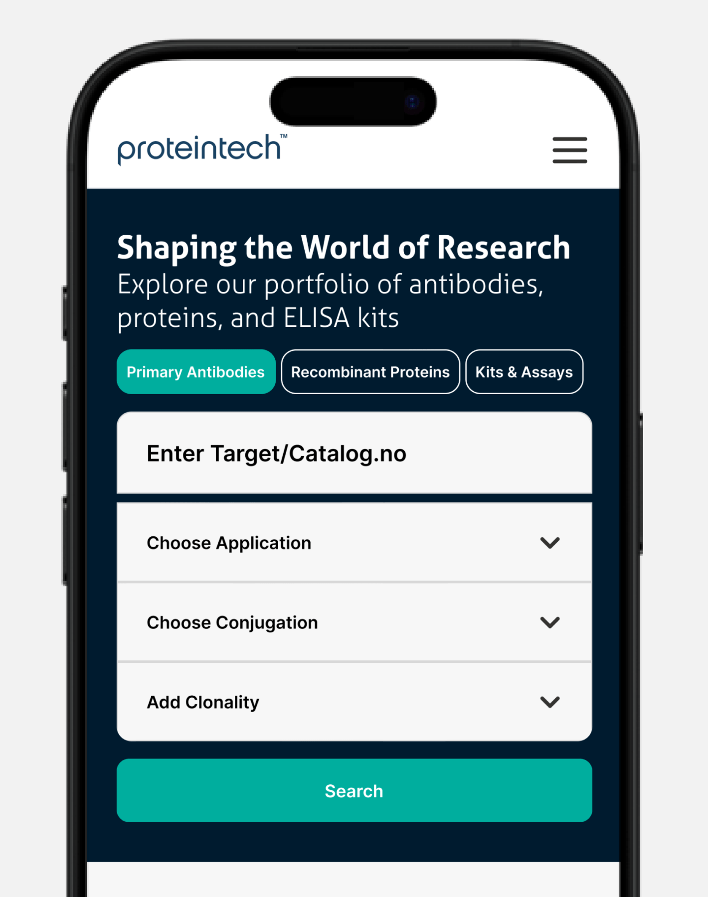
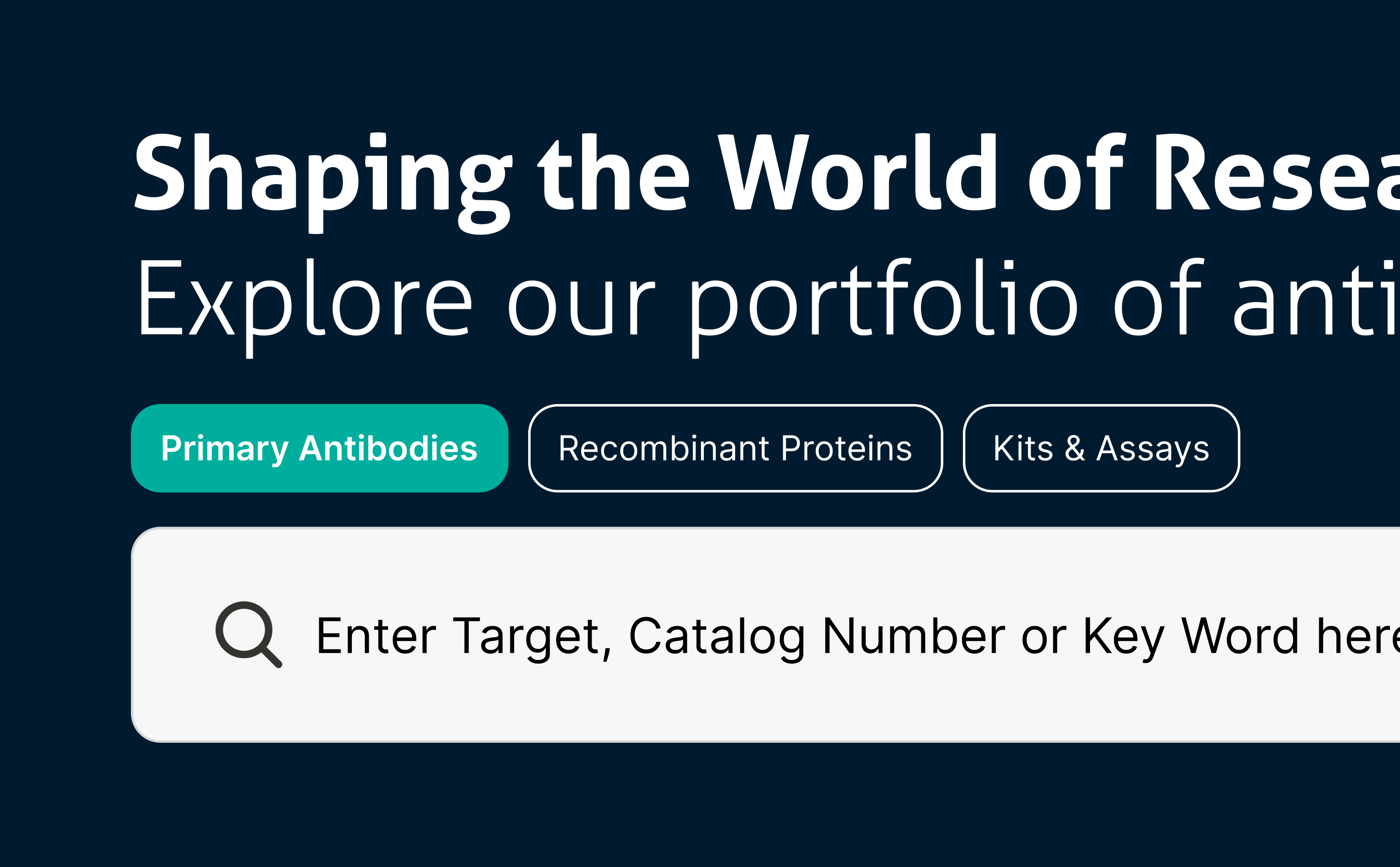
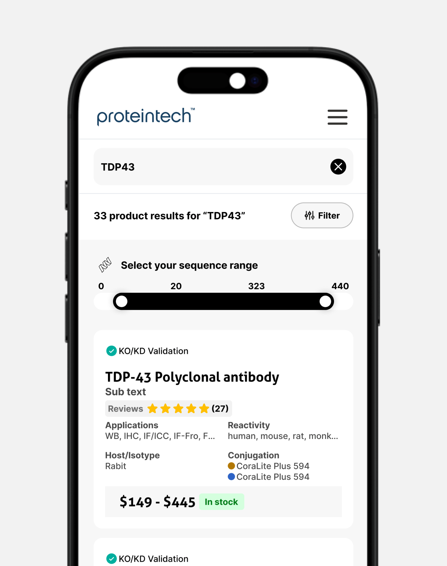
With drop-offs around 40% before completion, we knew there was room for improvement. Due to technical limitations, we couldn’t implement predictive text at this stage. Instead, we tested a clearer product structure, provided example search terms, and introduced a results dropdown to guide users. This showed a noticeable uptick in usability.
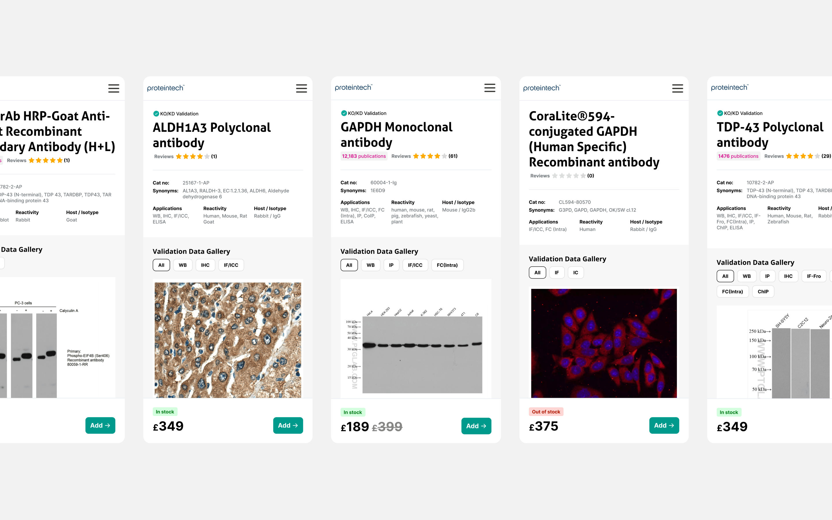
Results Page:
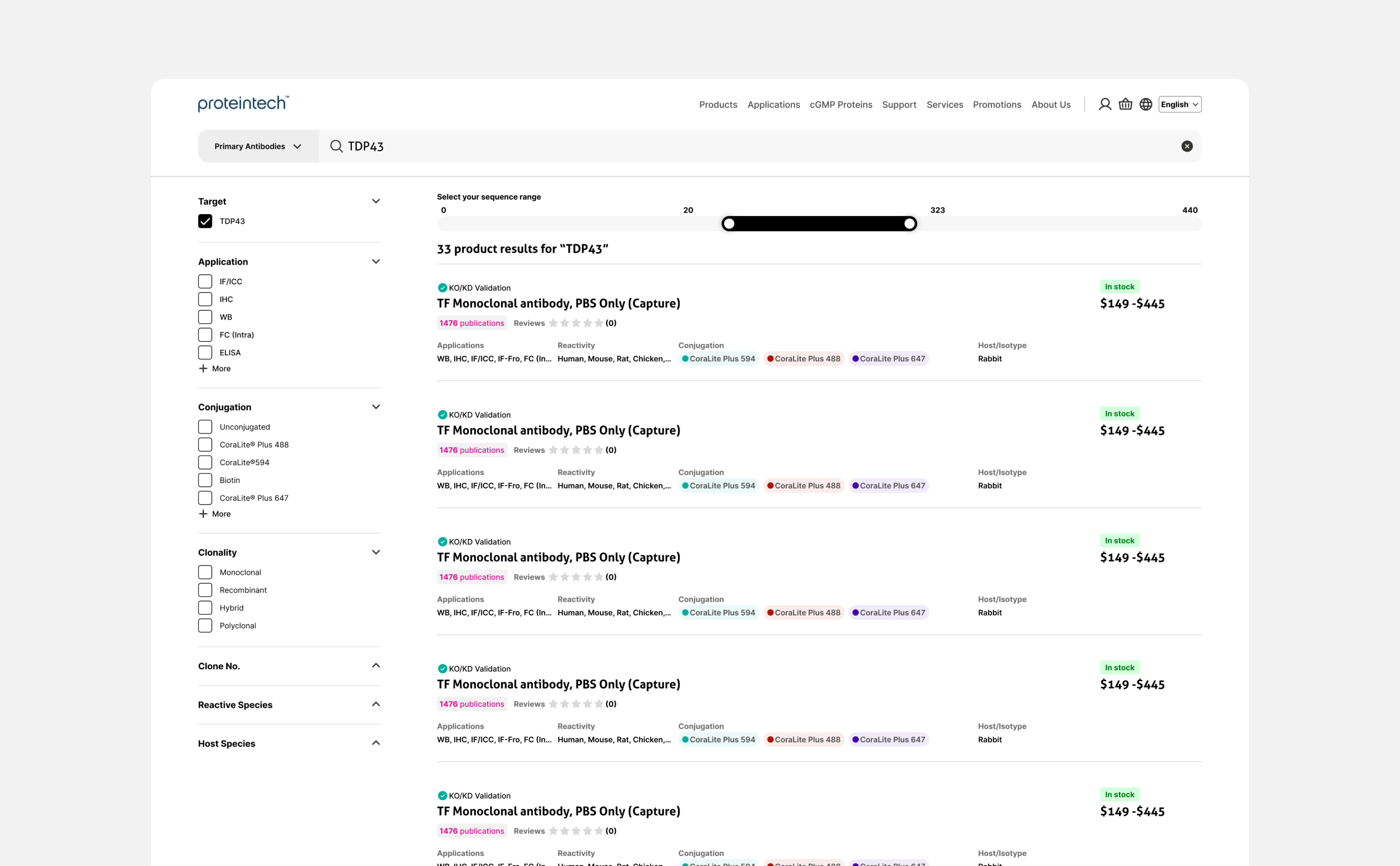
Our hypothesis was that filtering would help users narrow down their search—crucial for complex antibody selection. The previous Google-style collapsed filters went largely unused, as usability testing confirmed. We switched to a traditional layout with exposed filters on the left and used card sorting to clarify the data hierarchy. The UI was also cleaned up, removing inconsistent colors and typography that had crept in over time.
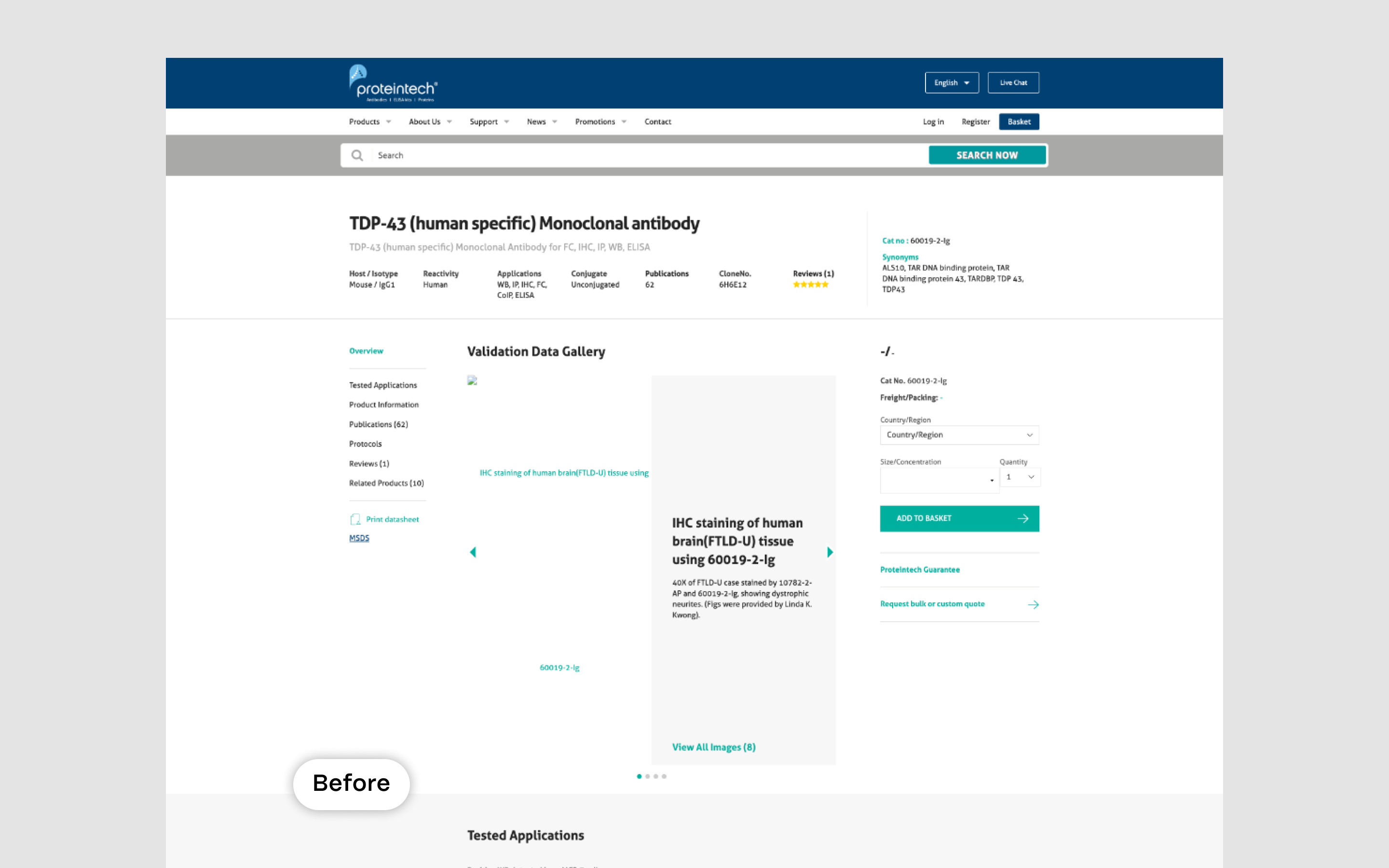
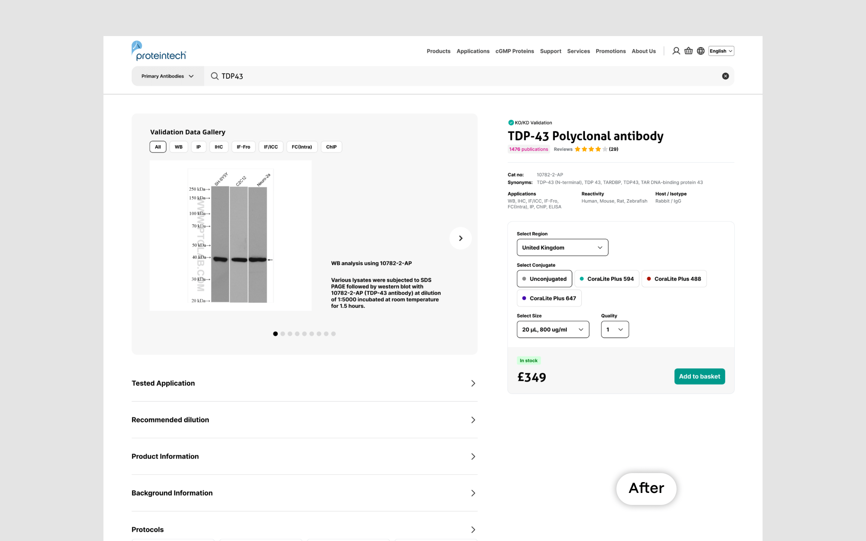
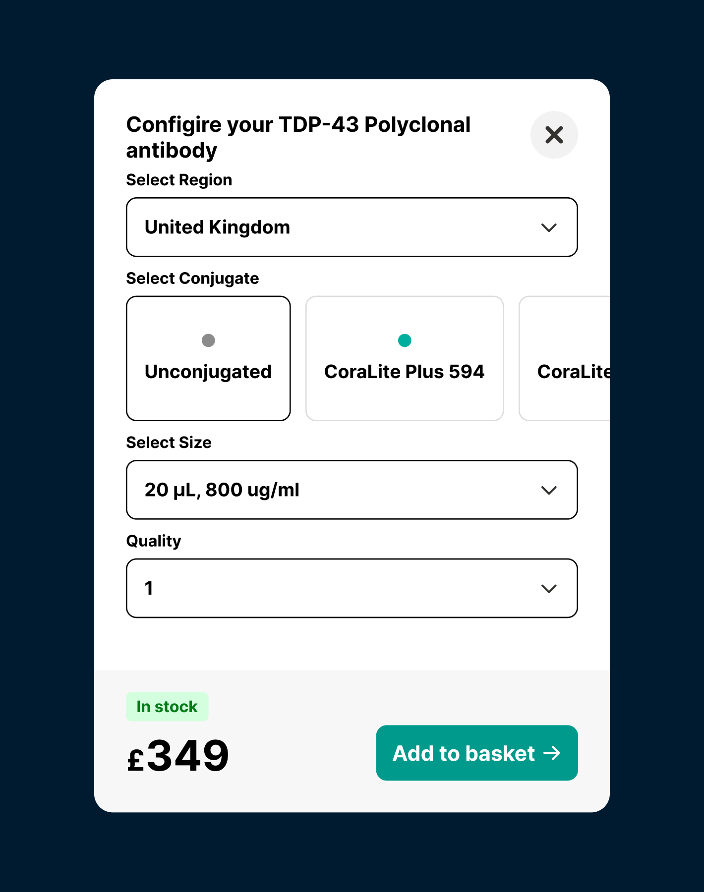
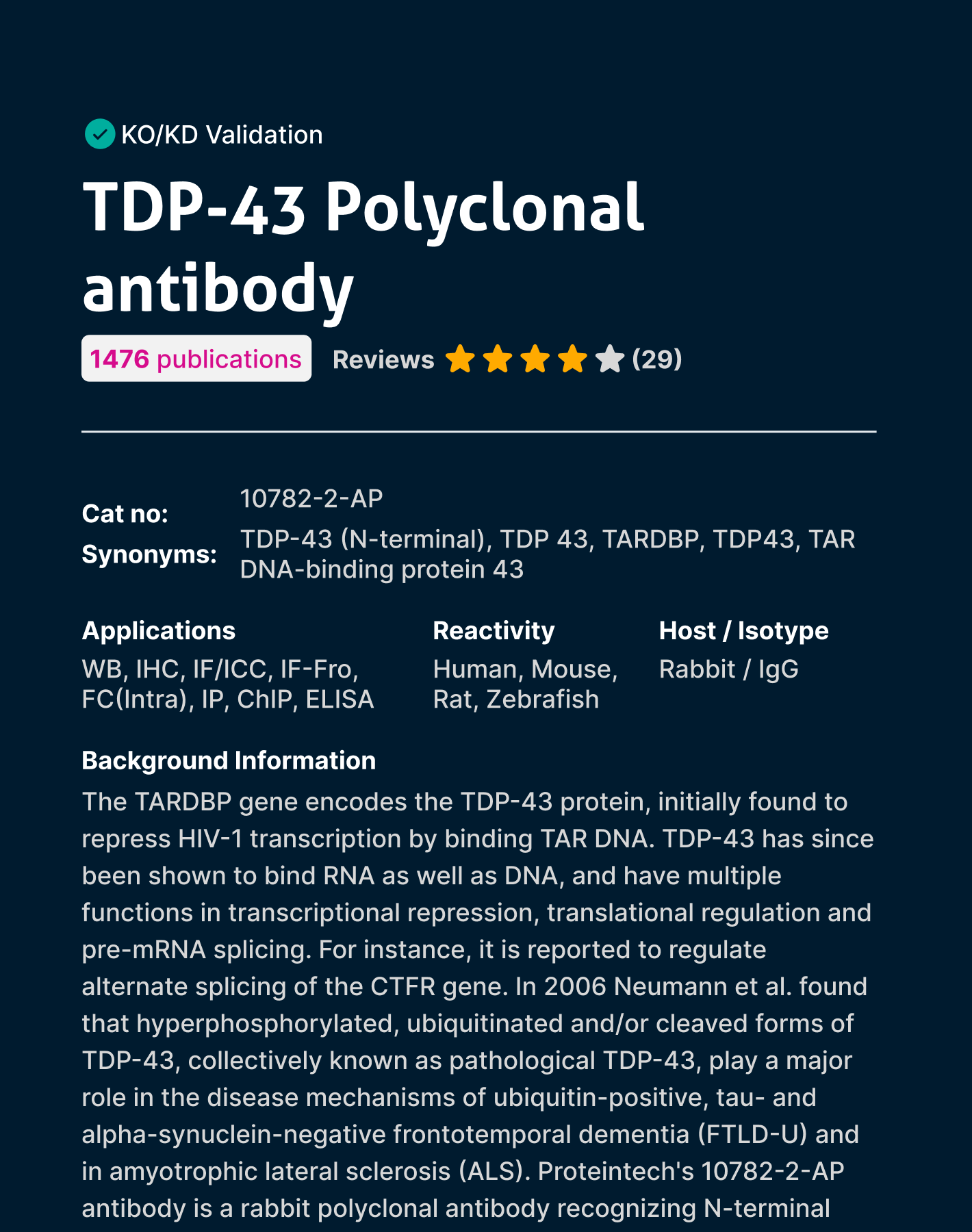
Product Page:
The data showed an 18% click rate for returning users, which we considered low—especially for a niche product where return users typically make purchases. Usability testing revealed confusion around product sizes and configurations, with multiple pages for the same product. This led to a data restructure, a new purchase component, and an updated layout. We also cleaned up the UI to ensure consistency throughout the flow.
© 2025 Nathan Griffiths